- Iterate
- Organizational Structure
- How the Rise of the Railroads Gave Way to the World's First Org Chart
How the Rise of the Railroads Gave Way to the World's First Org Chart
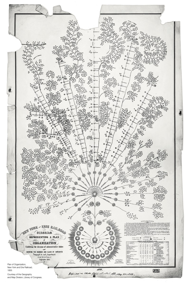
The size and scale of the U.S. railroads were unlike anything the business world had ever seen. In 1855 leading management thinker Daniel McCallum was brought in to help the New York and Erie Railroad organize its sprawling operation across the Northeast. The result is a masterful and intricate org chart, the first one the modern business world has ever seen.

In 1855, the New York and Erie Railroad Company had a problem.
Railroads were now the biggest operations the country had ever seen, both in terms of capital investment and the complexity of the organization. Just as new physical technologies, such as the telegram, were changing the game for businesses, the size and scale of the railroads meant it needed organizational technology too.
Keeping reporting lines organized not only helped keep track of the hundreds of different managers out on the front lines of the tracks, but was quite literally a matter of life and death.
“With a railroad, you are running cars (often in both directions on the same track) and you don’t have the ability to communicate live,” said Dr. Caitlin Rosenthal, an associate professor of U.S. history with a focus on the development of management practices at UC Berkeley. “The need to schedule out and manage contingencies in your data is just absolutely huge. Because if everybody doesn't know what's happening, then you have all kinds of deadly crashes.”
The railroad’s superintendent Daniel McCallum, who was also a leading management thinker at the time, was tasked with coming up with a solution. McCallum drew out an answer — a complex, layered, tree-like org chart. The first the modern world has ever seen.

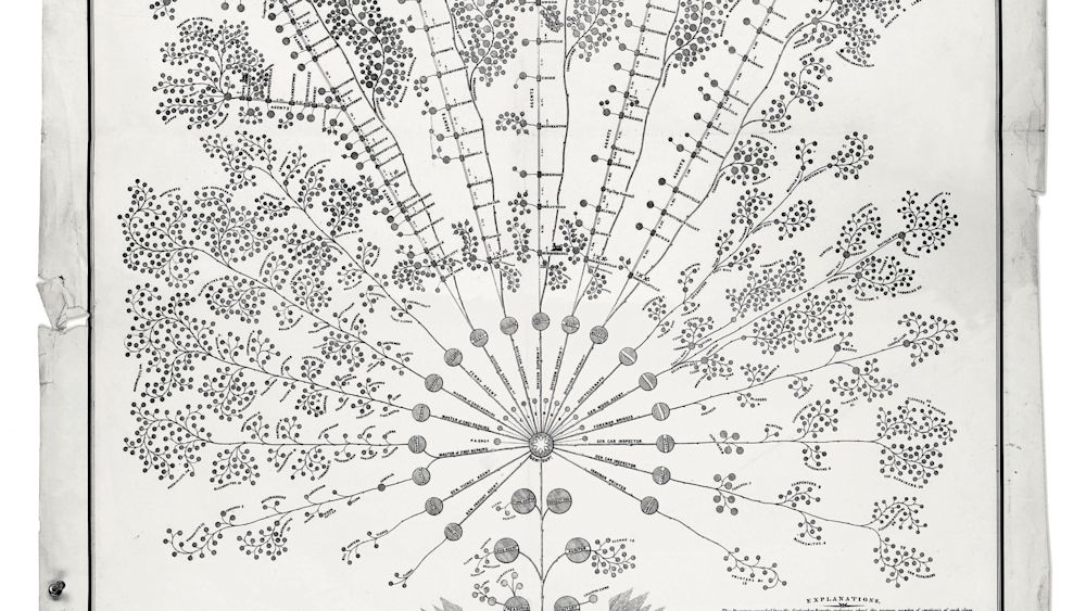
At first glance, the chart looks much more like a sprawling family tree or an ornate map than it does a managerial tool for data collection.
Renowned business historian Alfred Chandler was a voracious scholar of McCallum’s org charts, and went into great detail about the “Erie Plan” in his writings, describing the chart as follows:
“The design of the chart was a tree whose roots represented the president and the board of directors; the branches were the five operating divisions and the service departments, engine repairs, car bridge, telegraph, printing and the treasurer's and secretary’s offices; while the leaves indicated the various local ticket, freight, and forwarding agents, subordinate superintendents, train crews, foreman and so forth.”
One distinctive feature of McCallum’s Erie Plan is how it functions as both a map and an organizational chart.
“You can see the physical layout of the railroad,” Rosenthal says. “Not where it’s positioned geographically, but each line has its own organizational structure with a mix of people who moved with the train, and a mix of people who stayed on the line.
She says it is the communication between those two groups of people that became essential for figuring out what people’s responsibilities were and to solve communication problems before they began.
Rosenthal also points out that McCallum’s chart positions the most senior leaders in the company at the bottom, which is antithetical to how we view hierarchical org charts today.
“This just feels like a different kind of organization than the pyramid that has executives perched at the top,” Rosenthal says “Rather than at the bottom kind of supporting the organization as they are here.”
It is still murky on what McCallum’s org chart was exactly intended for.
“We know that other copies were made,” Rosenthal said. “We don't really know if it's produced for people to see who are in the organization, or if it's an outwardly-focused version presenting to the public what the organization is like.”
McCallum went on to create more organizational charts as a consultant for the Union Pacific Railroad and for the U.S. military in the decades following the Civil War.
Michael Cata, an independent researcher who has spent years studying Daniel McCallum’s organizational charts and his effect on modern businesses, was eventually able to track down one of McCallum's later org charts when he was working for the U.S. military.
“If you compare the New York and Erie railroad chart, which is the original one from 1855, with this one, you can kind of see two different strategies that are going in two different structures,” Cata said. “Something that McCallum definitely understood and practiced real-time is that an organization is not set up to serve the needs of functions, or the needs of the people inside the organization, it’s set up to solve problems.”
Despite McCallum’s advancements in the late 19th century, the prevalence of org charts didn’t take off for nearly another hundred years with the rise of business schools in the U.S. Cata says until then, org charts really only surface in historical documents as part of military or wartime efforts.
“The period following the Civil War up until 1910, things definitely went dark,” Cata says. “Leading up to World War One, org charts start to become more and more apparent. They became extremely apparent in the 1940s because you needed them to run World War II. The golden age of org charts interestingly all center around wartime.”
Cata says the modern org chart as we know it emerged in the 1960s and 70s with the rise of American business schools. The hierarchical structure that we are all familiar with today was part of the homogenization of these schools.
But McCallum’s complex and map-like org chart lives on as an example of how early management thinking helped solve complex problems that arose in some of the earliest scaling organizations in the country — and they probably helped save several lives in the process.
Create your own free org chart today!
Show off your great team with a public org chart. Build a culture of recognition, get more exposure, attract new customers, and highlight existing talent to attract more great talent. Click here to get started for free today.


The ORG helps
you hire great
candidates
Free to use – try today